
Historical Gold and Silver Prices: Compare Trends, Cycles, and Market Performance
Historical Precious Metal Prices: How to Read, Compare, and Use Long-Term Data
Gold, silver, platinum, and palladium have each followed distinct price paths over the past five decades. Those paths contain crashes, bubbles, decade-long bear markets, and sudden spikes tied to real-world events. This guide walks through what historical precious metal prices actually show, how to read and compare them across metals and time periods, and how to put that information to work in your own investment decisions.
Key Takeaways
- Historical precious metal prices for gold, silver, platinum, and palladium reveal long-term trends, bubbles, and crashes that live prices alone cannot show. Historical data spans over 20 years for price analysis, covering full economic cycles.
- Reliable price history stretches back decades in fiat terms: gold’s 1980 spike to ~$850/oz, silver’s Hunt brothers squeeze near $50/oz, platinum’s 2008 run above $2,200/oz, and palladium’s 2021 record near $2,981/oz. These milestones anchor current prices in context.
- Live prices provide a snapshot of current market conditions, while historical data (end-of-day or intraday records) shows where today’s price sits in a 5-, 10-, or 20-year range. Both are needed for timing entries and exits.
- Historical charts let you compare how each metal behaves during inflation shocks, recessions, and crises (2008, 2011, 2020). Precious metals often serve as hedges against rising inflation and as safe-haven assets during crises.
- Investors can use long-term price history to choose strategies such as dollar-cost averaging, diversification across metals, or hedging portfolios against currency and equity risk.
1. What Historical Precious Metal Prices Are (and How They Differ from Live Prices)
Historical precious metal prices are recorded spot prices for gold, silver, platinum, and palladium over past days, months, and decades. They contrast with live prices, which update second by second and reflect what buyers and sellers are willing to pay right now. Live prices give you a snapshot of today’s market conditions. Historical data tells you whether today’s price is high, low, or middle-of-range compared to the last 10 or 20 years. The “spot price” is the global benchmark for immediate settlement, typically quoted per troy ounce in USD. Spot prices reflect the market value of precious metals at any given moment. Historical data usually stores the closing, high, and low price for each trading day. Gold prices are tracked in real-time on multiple platforms, and those real-time quotes become tomorrow’s historical record. Historical data can be stored at different frequencies:
- Daily: closing price, high, low, open. Most common for long-term analysis.
- Weekly/Monthly: averaged or closing values. Useful for smoothing out noise.
- Intraday: 1-minute or 5-minute bars. Mainly used by traders rather than long-term investors.
Serious investors look at both. Live prices show what the market is doing right now. Historical charts show where today’s price sits in a 5-, 10-, or 20-year context, which is the kind of perspective you need before committing capital.
2. Major Historical Price Milestones for Key Precious Metals
This section walks through concrete price landmarks for gold, silver, platinum, and palladium from the 1970s to the 2020s. These milestones help you anchor current prices against the past and understand the forces that moved each metal.
Gold
Gold prices often rise during financial uncertainty. High inflation drives demand for gold as a store of value, and lower interest rates make non-yielding assets like gold more attractive. Here are the key waypoints:
| Date | Approx. USD/oz | What Happened |
|---|---|---|
| Pre-1971 | $35 (fixed) | Bretton Woods system pegged gold at $35/oz |
| August 1971 | ~$42 | Nixon ended dollar-gold convertibility; price began to float |
| January 1980 | ~$850 | Inflation, oil shocks, and geopolitical tension pushed gold to its first major peak |
| Mid-1999 | ~$252 | Bear market low after nearly two decades of stagnation |
| September 2011 | ~$1,921 | Post-2008 crisis bull run peak; commodity supercycle, low rates |
| August 2020 | ~$2,075 | COVID-19 pandemic, massive stimulus, near-zero real rates |
| Late January 2026 | ~$5,600 | First time gold crossed $5,600/oz, driven by central bank buying exceeding 1,000 tonnes annually in 2022-2024 |
Gold’s nominal return since floating in 1971 is over 60x. But the path was not smooth. The 1980s saw a -35% decade, and the 1990s lost another -29%. Historical gold prices provide insights for refining strategies precisely because they show both the rallies and the long dry spells.
Silver
Silver prices reflect both investment and industrial demand, which makes the metal more volatile than gold. Silver is used extensively in electronics and solar energy, adding an industrial demand layer that gold lacks.
- 1980: The Hunt brothers’ squeeze pushed silver to ~$49.45/oz on the London Fix (January 18, 1980). The annual average for 1980 was $20.63/oz, the high near $48, and the year-end close only $15.65. Investor sentiment and speculation drove the spike; the crash followed within weeks.
- 1990s: Silver hovered mostly between $4 and $7/oz for years. Minimal investment interest, stable industrial consumption.
- 2011: Silver surged again to ~$48.70/oz on the London Fix, nearly matching the 1980 nominal high but still far below the inflation-adjusted value of that earlier peak (roughly $200+ in today’s dollars).
- 2015-2024: A volatile range between roughly $12 and $30/oz, with periodic spikes tied to stimulus events and industrial demand shifts.
Gold and silver prices fluctuate due to economic and geopolitical factors, but silver’s industrial exposure amplifies its swings in both directions.
Platinum
Platinum prices are sensitive to industrial demand fluctuations, particularly from the automotive sector. Through the 1990s and early 2000s, platinum commonly traded at a premium to gold, sometimes 1.5x to 2x gold’s price. That changed:
- March 2008: Platinum hit its all-time high of approximately $2,290/oz. By November 2008, it had crashed to ~$750, a drop exceeding 60% in eight months as the global financial crisis crushed industrial demand.
- 2015 (Dieselgate): Regulatory pressure on diesel vehicles slashed platinum demand for catalytic converters. The price fell to ~$1,053 and continued declining.
- 2020: COVID-era panic pushed platinum below $600/oz before recovery. By 2025, prices had climbed back toward $2,000/oz as hydrogen economy applications and supply deficits supported the market.
Platinum flipped from trading at a premium over gold to a large discount after the mid-2010s. That shift was driven by a specific cause: European and North American regulators tightened rules on diesel emissions, reducing the vehicle segment that consumed the most platinum.
Palladium
Palladium is crucial for vehicle emissions control systems. Its price history reflects that dependence. Palladium prices are influenced by vehicle emissions regulations, and tightening standards in Europe, China, and the U.S. drove a multi-year rally.
- Pre-2000: Prices commonly under $500/oz.
- Late 2010s: Rising emissions standards for gasoline vehicles pushed palladium above $1,000/oz as demand outstripped supply.
- May 2021: All-time high of $2,981.40/oz.
- Post-2021: Sharp pullbacks as automakers began substituting platinum for palladium and electric vehicle adoption reduced catalytic converter demand.
Supply dynamics such as mining output and discovery also play a role. South Africa and Russia dominate PGM mining. Power outages, strikes, and export restrictions in those countries have caused sharp supply disruptions.
What These Milestones Show
Each metal has a different risk and reward profile. Gold acts as a long-term store of value with relatively smoother cycles. Silver is more volatile and industrially sensitive. Platinum and palladium are highly cyclical, industrially driven metals whose prices can collapse when a single demand sector contracts. Rhodium is the most volatile precious metal due to limited supply and concentrated demand from catalytic converters. Rhodium is often the highest-priced precious metal, having traded above $25,000/oz in 2021 before falling back below $5,000. While some data providers show only 1-2 years of downloadable history, robust datasets extend 20+ years. That depth is what separates seeing a full cycle from seeing only the latest rally or correction.

2.1 Comparing Metals Across Economic Cycles
Investors learn most when they compare historical price behavior of multiple metals during the same economic episodes. Precious metals are viewed as safe-haven assets during crises, but the degree of protection varies by metal. Here is how the four metals responded to shared episodes:
2008 Global Financial Crisis: Gold fell from ~$1,000 to ~$700 but recovered within months. Platinum crashed over 60% from its $2,290 peak to ~$750. Silver dropped from ~$20 to ~$9. Palladium also fell steeply. Gold held up better because its demand is less tied to industrial production cycles.
2011 Commodity Peak: Gold hit ~$1,921/oz, silver reached ~$48.70, platinum peaked near $1,721, and palladium was elevated by emissions legislation. After 2011, all four declined, but gold’s drawdown was shallower.
2020 COVID Shock: Gold surged to $2,075/oz while platinum briefly fell below $600. The divergence happened because gold’s buyers are driven by fear of currency debasement, while platinum’s buyers are industrial consumers who cut orders when factories shut down. Geopolitical instability can lead to increased demand for safe-haven assets, which tends to benefit gold and silver more than platinum or palladium. The strength of the U.S. dollar has an inverse relationship with metal prices; when the dollar weakens, metals priced in USD tend to rise, and this effect shows up clearly in historical charts during periods of dollar depreciation. One useful exercise: calculate how many ounces of silver, platinum, or palladium one ounce of gold could buy at various points. In 2008, one ounce of gold bought roughly one ounce of platinum. By 2024, one ounce of gold bought more than four ounces of platinum. That ratio tells you when one metal may be historically cheap or expensive versus another. Relative ratio analysis does not guarantee future returns. But it gives a structured way to think about cross-metal value rather than staring at single price charts in isolation.
3. How to Use Historical Price Charts and Timeframes Effectively
This section focuses on practical chart usage: which timeframes matter, how to read common chart types, and how to combine live prices with historical data for better decisions. Historical charts help identify longer-term trends in prices that short-term views obscure.
Timeframes and What They Show
| Timeframe | Best For | Watch Out For |
|---|---|---|
| 24-hour / intraday | Day traders, news reactions | Noise; not useful for investment decisions |
| 7-day | Short-term swing traders | Still too narrow for trend identification |
| 1-month | Monitoring recent momentum | Misses seasonal and cyclical patterns |
| 1-year | Medium-term trend identification | May capture only one leg of a cycle |
| 5-year | Seeing at least one full correction | Good starting point for investors |
| 10-20+ year | Full cycle analysis, valuation zones | Requires log scale for accurate visual reading |
Start by zooming out to the 5- to 20-year view. This tells you whether the current live price is near a historic high, low, or somewhere in the middle. Then zoom in to shorter timeframes for entry and exit timing.
Reading Interactive Charts
Interactive charts allow examination of specific historical values. Most charting tools let you:
- Set custom start and end dates to isolate specific periods
- Toggle between linear and log scales (log scale is better for decades-long data because it shows percentage change consistently)
- Switch between currencies and weight units like troy ounces, grams, and kilograms
- Historical prices can be filtered by metal and date, so you can compare gold’s behavior in 2008 against silver’s behavior in the same period
Mark major events directly on your chart view. When you see a 15% drop in March 2020, labeling it “global COVID lockdowns” turns a confusing spike into a data point with context. Price moves are tied to real-world shocks; without labels, a chart is just a squiggle.
Bid, Ask, and Spreads
In both live and historical data, you will find bid and ask prices. The bid is what buyers will pay; the ask is what sellers want. The difference is the spread. Narrower spreads indicate higher liquidity and tighter pricing, especially during normal trading hours in major markets like London (LBMA) and New York (COMEX). Historical spread data can reveal stress periods. During the March 2020 panic, gold bid-ask spreads widened from a few cents to several dollars per ounce as traders pulled back liquidity.
Comparing Metals to Other Assets
Compare historical charts of precious metals to other assets like stock indices or inflation data. During the 2000s, gold returned +281% while the S&P 500 was roughly flat. During the 2010s, gold returned only +27% while stocks surged. This back-and-forth reinforces that metals act as diversifiers; they tend to do well when equities struggle, and lag when equities boom.

3.1 Using Historical Data for Strategy: Dollar-Cost Averaging and Timing
Dollar-cost averaging into precious metals means investing a fixed amount at regular intervals regardless of current live prices. If you put $500 per month into gold, you buy more ounces when prices are low and fewer when prices are high. Dollar cost averaging protects investments over the long term by smoothing out the impact of volatility. When you study long-term historical price charts, you see repeated cycles of booms and corrections. Gold fell from $850 in 1980 to $252 in 1999, then rose to $1,921 in 2011, dropped to ~$1,050 in 2015, and climbed past $2,000 in 2020. Trying to perfectly time those turns is extremely difficult. Even professionals struggle to consistently buy at multi-year lows or sell at exact peaks. A more practical approach: use historical charts to define broad valuation zones rather than pinpointing one perfect price.
- Below long-term average: Increase regular contributions.
- Near long-term average: Maintain standard contributions.
- Near previous cycle highs: Consider reducing contributions or rebalancing.
Market conditions and psychological factors affect investor behavior towards precious metals. When gold is making new highs, the urge to buy is strongest, but historical data shows that buying near peaks often leads to years of waiting for breakeven. The chart is the antidote to the impulse. Historical price history also helps with planning exits. If today’s live price is near an old multi-year resistance area visible on charts, some investors reduce positions or rebalance rather than add at elevated levels.
4. Practical Considerations, Data Quality, and Limits of Historical Prices
Historical precious metal prices are powerful research tools, but they have limitations. Interpreting them without understanding those limits can lead to false confidence.
Data Quality and Source Differences
Not all “historical prices” measure the same thing:
- Spot prices: The underlying benchmark; what most charts track.
- London Fix / LBMA Gold Price: A twice-daily auction benchmark used for contracts and settlements.
- Futures settlements: Prices from CME Group’s COMEX exchange, which include a time premium.
- Retail prices: What you actually pay for coins or bars; includes dealer mark-ups, fabrication costs, and shipping.
Most historical charts track spot or benchmark prices, not retail prices. In times of high demand or low supply, retail premiums can rise sharply, causing actual coin and bar prices to diverge from the raw historical spot price graph.
Coverage Gaps
Some providers show only 18 months of downloadable data. Others offer over 20 years. Historical data spans over 20 years for precious metals on the better platforms, but verify how far back a dataset goes before drawing long-term conclusions. The LBMA, for instance, discontinued public display of some long platinum and palladium series as of July 1, 2026.
Structural Changes Over Time
History rhymes but does not repeat exactly. Several structural shifts change how metals behave:
- Central bank policies (quantitative easing, reserve accumulation) have grown gold demand in ways that did not exist before 2008.
- Exchange-traded products (gold ETFs launched in 2003-2004) opened the market to new buyers who never would have purchased physical metal.
- Supply dynamics such as mining output and discovery in South Africa and Russia shape platinum and palladium supply unpredictably.
- The transition from internal combustion engines to electric vehicles is reducing long-term demand for catalytic converter metals.
Past performance of precious metals does not guarantee future returns, even though historical charts reveal patterns in how metals respond to inflation, currency weakness, or financial stress.
Cross-Check and Context
Cross-check historical price information from multiple reputable sources: the World Gold Council, the Silver Institute, major exchanges, and long-established data vendors. Guard against errors, especially with very old or illiquid series. Treat historical prices as one component of a broader decision framework. That framework should also include current macroeconomic conditions, your time horizon, risk tolerance, and the role of each metal in your overall financial plan.
Shop Gold and Silver
Compare current availability across recognizable sovereign coins, fractional gold, and investment-grade bars and rounds from Agate Precious Metals.
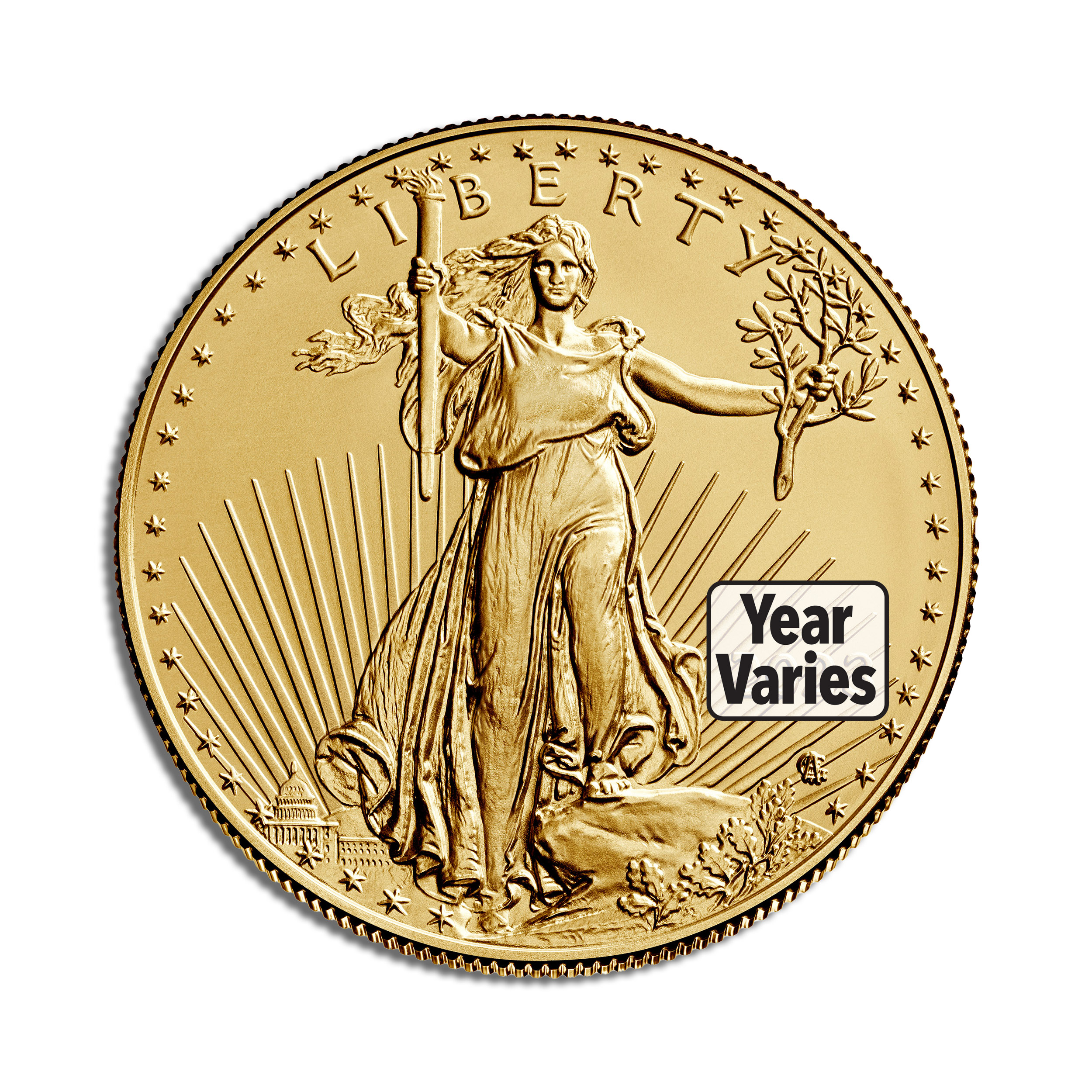
1 oz Gold Eagle – BU
A highly recognizable year-varies American Gold Eagle bullion coin.
View Current Price & Availability →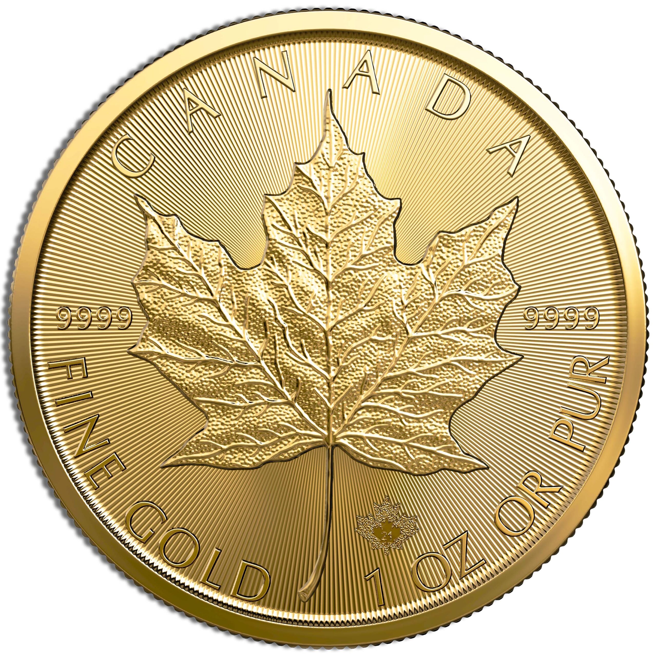
1 oz Gold Maple Leaf
A year-varies Canadian sovereign coin struck in .9999 fine gold.
View Current Price & Availability →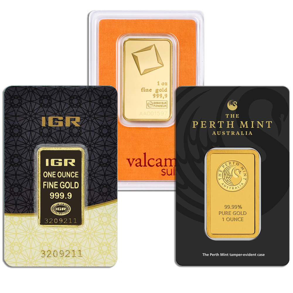
1 oz Gold Bar – Carded
A .9999 fine one-ounce gold bar from a recognized producer.
View Current Price & Availability →
1 gram Gold Bar – Carded
A compact fractional gold bar sealed in a protective assay card.
View Current Price & Availability →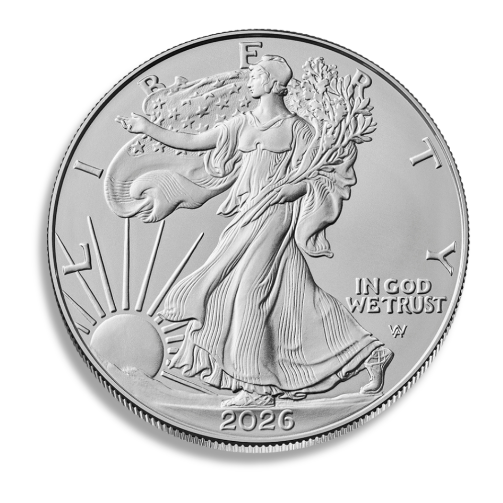
2026 Silver American Eagle
A current-year one-ounce American silver bullion coin.
View Current Price & Availability →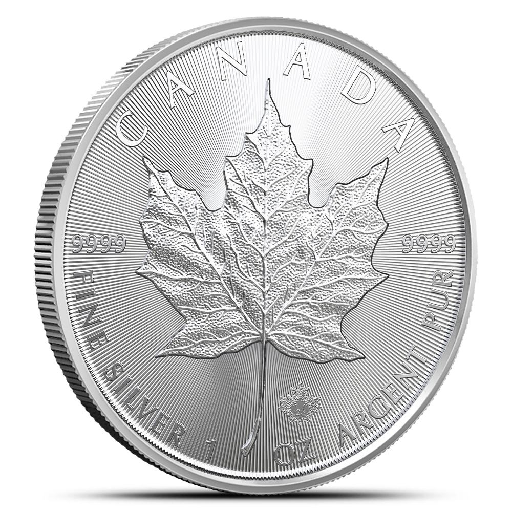
2026 1 oz Silver Maple Leaf
A current-year Canadian bullion coin struck in .9999 fine silver.
View Current Price & Availability →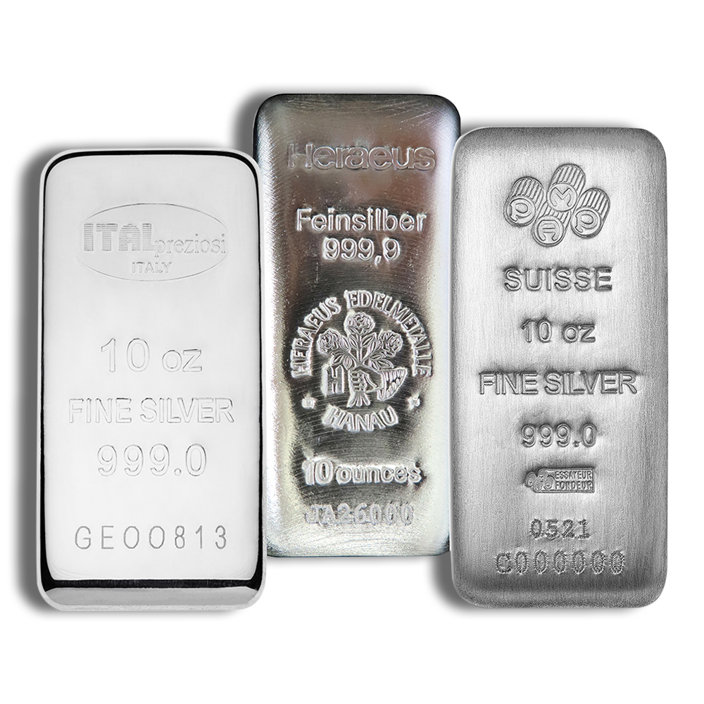
10 oz Silver Bar
An IRA-eligible silver bar offering efficient weight and storage.
View Current Price & Availability →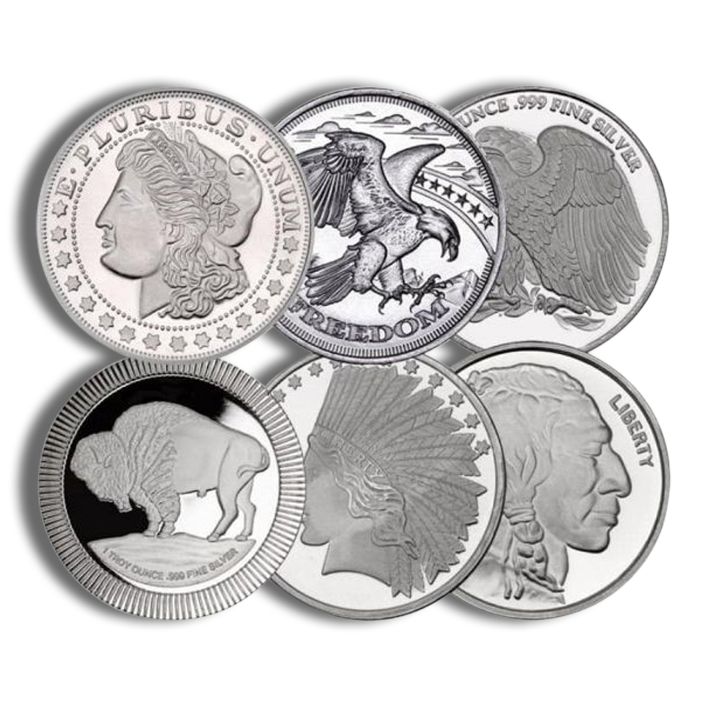
1 oz Silver Round
An IRA-eligible .999 silver round with a design that varies.
View Current Price & Availability →Product availability and pricing can change with inventory and precious-metal markets. Follow each product link for current information.
FAQ
How far back do reliable historical precious metal price records go?
Modern, day-by-day spot price records for gold and silver are widely available from the early 1970s onward, coinciding with the end of the Bretton Woods system and freely floating prices. Platinum and palladium also have several decades of reliable data, though very detailed intraday histories may only span the last 10-20 years depending on the provider. Historical data spans over 20 years for most metals on major platforms.
Why do historical charts for coins and bars look different from spot price charts?
Spot charts track the underlying market benchmark. Retail bullion prices include premiums, fabrication costs, and dealer spreads. In times of high demand or tight supply, these premiums can rise from 3-5% over spot to 15-20% or more, causing actual coin and bar prices to diverge from the raw historical spot price graph. The gap is especially visible during panics like March 2020, when physical gold premiums spiked even as spot prices temporarily dipped.
Can I use historical prices to predict future gold or silver prices precisely?
Historical precious metal prices are best used to understand typical behavior, volatility ranges, and reactions to economic conditions. They do not generate precise price forecasts or guaranteed targets. Future policy decisions, technology shifts (such as electric vehicle adoption reducing palladium demand), and unexpected events can change market dynamics in ways that no historical chart captures.
Which time horizon is most useful when starting to analyze historical precious metal data?
Start with 5- and 10-year charts for each metal to see at least one full cycle of rally and correction. Once you understand the broader pattern, zoom out further to 20+ years if the data is available. Short 1-month or 3-month views are valuable only after you have the longer-term context, because without it, a one-month dip might look catastrophic when it is actually a routine pullback within a bull market.
Should I look at historical precious metal prices in my local currency or in U.S. dollars?
Review both. U.S. dollar charts are the global standard because most precious metal markets are quoted in USD. But local-currency charts matter for individual investors because exchange-rate movements can add or subtract returns when converted back to your home currency. For example, gold in USD rose about 27% during the 2010s, but gold in Brazilian reais or Turkish lira rose far more because those currencies weakened against the dollar during the same period.
Explore the complete precious-metals selection at Agate Precious Metals.