
Precious Metals Price Charts: Track Gold, Silver, Platinum, and Palladium
Precious Metals Price Charts: Gold, Silver, Platinum, and Palladium
Precious-metals price charts show how a specified gold, silver, platinum, or palladium price changes over time. To compare charts, match the currency, weight unit, observation time, and type of quote. A benchmark auction, an intraday spot quote, and a retail product price answer different questions.
Use this guide to choose a reliable chart, interpret the four metals separately, and understand how a reference price relates to the cost of physical coins and bars.
Choose a Price Source and Check Its Timestamp
The LBMA precious-metal price pages provide information about benchmark prices for gold, silver, platinum, and palladium. A benchmark set through a scheduled process differs from a continuously updating market quote. Neither is automatically the price at which a dealer will sell you a particular coin or bar.
Before relying on any chart, identify its provider, instrument, bid or ask basis, currency, weight unit, last observation time, time zone, and any delay. A chart that has stopped moving during a market closure may simply be displaying its last available observation.
Chart status: This article explains chart data and links to a benchmark source. It does not contain a connected live price feed. Check the linked provider for its latest available data.
Gold Price Charts
Gold charts can help you observe changes in a metal-market reference over a selected period. They do not include the premium on a particular Gold Eagle, Maple Leaf, or bar. Compare the chart observation and retail listing at approximately the same time, using the same currency and fine-gold weight.
For jewelry, a gold chart is only one input. Karat, verified weight, gemstones, and non-gold components affect the metal estimate. Use Agate’s gold melt-value guide for karat calculations and its gold bars versus coins guide for physical-format comparisons.
Silver Price Charts
A silver chart shows a specified reference price over time. The price of a Silver Eagle, Maple Leaf, round, or ten-ounce bar also reflects its product premium. That premium may change independently of the silver reference, especially when demand or availability changes for one format.
Agate’s silver price-per-ounce guide explains quote timing and gram conversions. The separate silver market-trends guide examines possible market drivers.
Platinum Price Charts
A platinum reference price does not include the premium, delivery, or eventual resale costs of a retail bar or coin. When comparing platinum with another metal, use the same dates and fine-troy-ounce units. A greater percentage move on a chart does not establish which purchase will produce the better result after transaction costs.
Check the platinum information in the LBMA benchmark directory, then compare that reference with a current, item-specific dealer quote.
Palladium Price Charts
For physical palladium, compare a chart with both an actual purchase price and a prospective resale bid for the same format. The chart does not show the spread available for a specific bar or coin. Brand, condition, size, and local buyer demand can affect the transaction.
Read Agate’s physical palladium guide for buying, verification, storage, and resale considerations.
Which Type of Precious-Metals Chart Do You Need?
| Chart type | Useful for | Check before using it |
|---|---|---|
| Intraday quote | Observing shorter-term price movements. | Quote source, timestamp, delay, bid or ask basis, and market hours. |
| Daily benchmark | Using a consistently defined observation for comparison. | Benchmark process, date, currency, and publication schedule. |
| Historical chart | Comparing a metal across months or years. | Data gaps, chart scale, currency, and start and end dates. |
| Multi-metal chart | Comparing gold, silver, platinum, and palladium over the same period. | Whether values show dollars per ounce or indexed percentage changes. |
| Retail product history | Following the listed price of a specific coin or bar. | Whether changes came from the metal reference, product premium, or both. |
Compare Charts on Equal Terms
Percentage change = (ending price − starting price) ÷ starting price × 100. A hypothetical move from $100 to $110 is a 10% increase. Use the same observation window for each metal. This calculation describes a reference-price movement; it does not include the costs of buying, storing, or selling physical metal.
- Currency: A move in the exchange rate can change a metal’s local-currency chart.
- Instrument: A dated futures contract can differ from a spot reference or auction benchmark.
- Time zone: Different observation times can produce different daily changes.
- Scale: Dollar charts compare price levels; indexed charts compare percentage performance.
- Weight: Precious metals are commonly compared per troy ounce, approximately 31.1035 grams.
Shop Gold and Silver
These Agate product examples show how chart references relate to different physical formats. Product images may be representative. Open each listing for its current specifications, price, packaging terms, and availability.
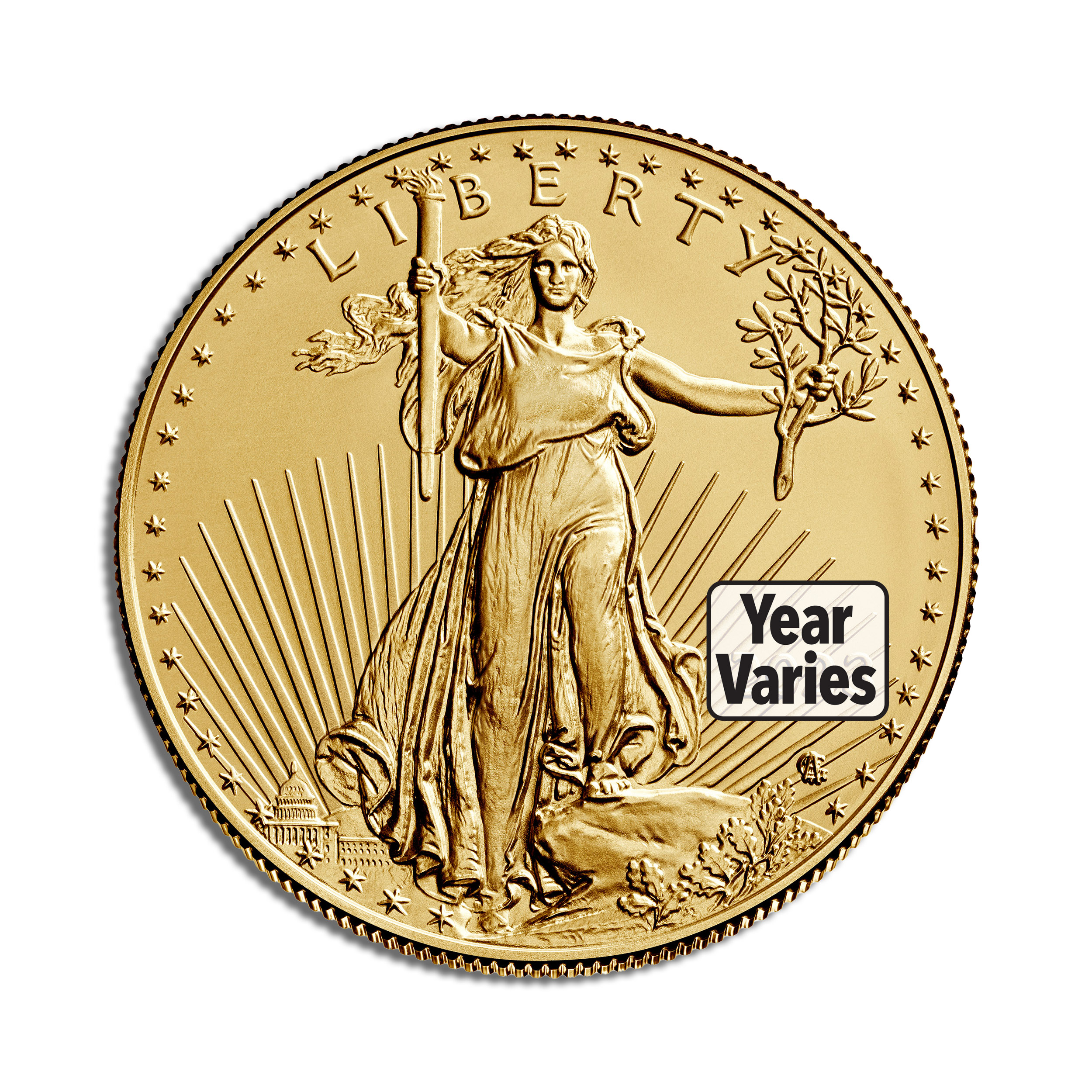 Gold coin
1 oz Gold Eagle – BU (Year Varies)
Compare the year-varies and condition terms before ordering.
View Current Price & Availability →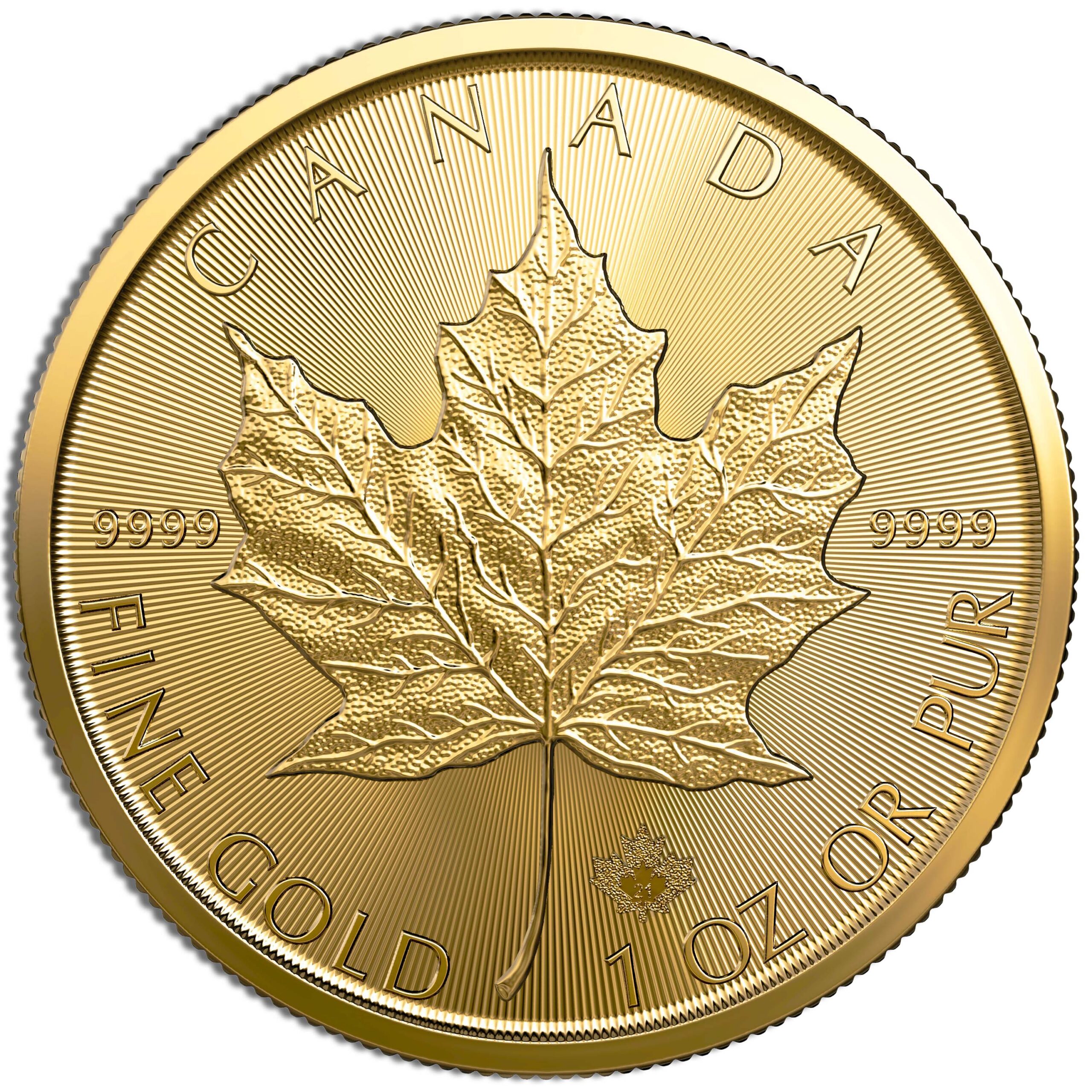 Gold coin
1 oz .9999 Gold Maple Leaf (Year Varies)
Confirm the delivered year and current listing details.
View Current Price & Availability →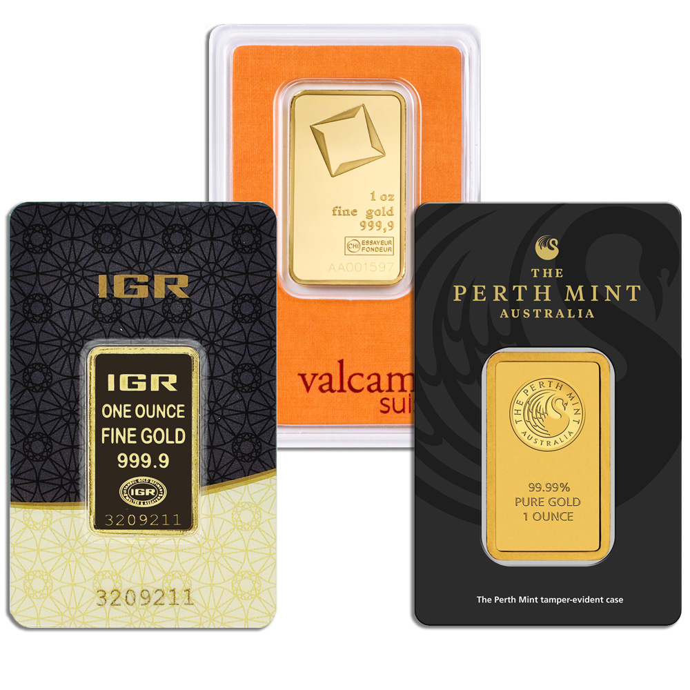 Gold bar
1 oz Gold Bar – Brand Varies .9999 (Carded)
The supplied brand can vary under the listing terms.
View Current Price & Availability →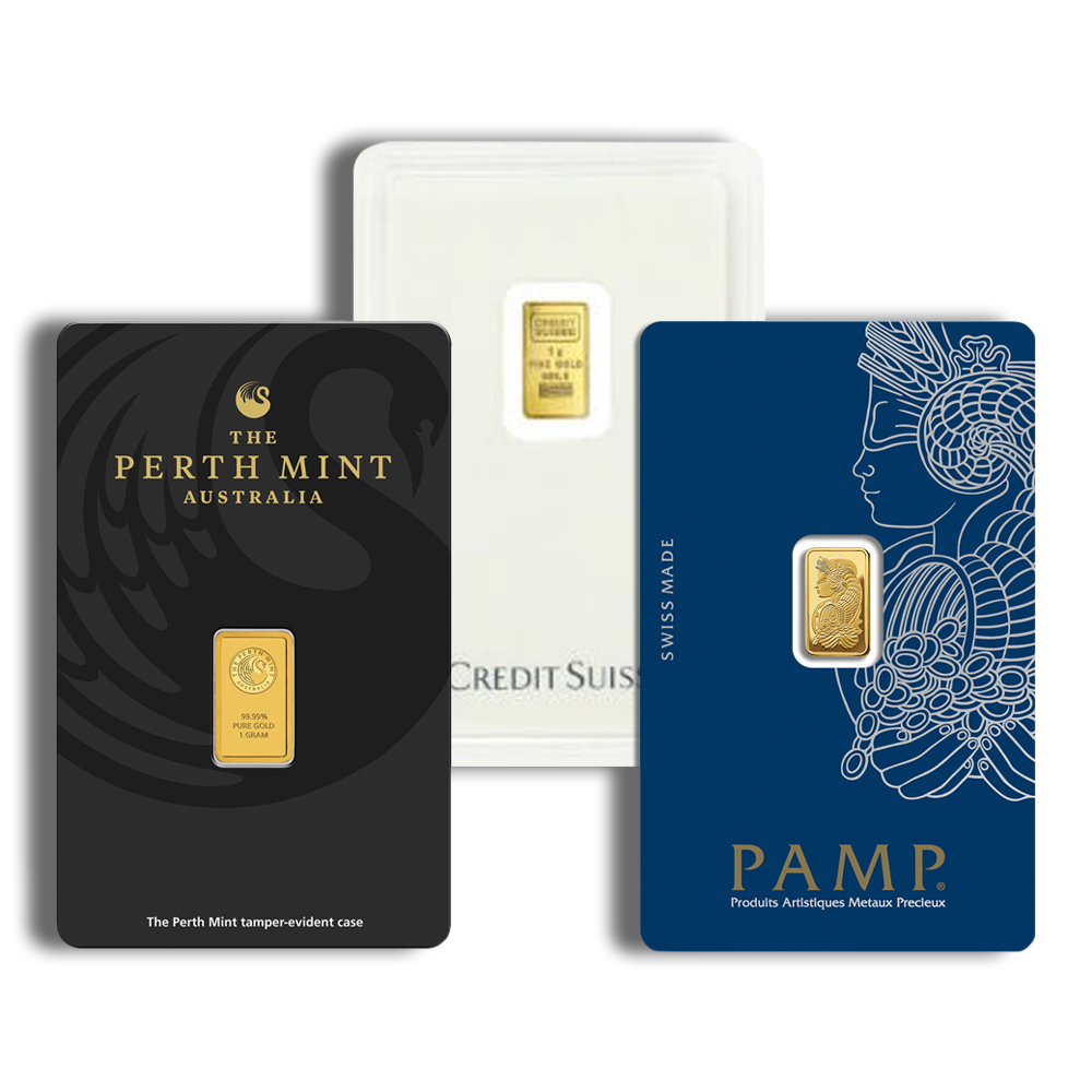 Fractional gold
1 gram Gold Bar – Brand Varies (Carded)
Review the stated brand and packaging terms.
View Current Price & Availability →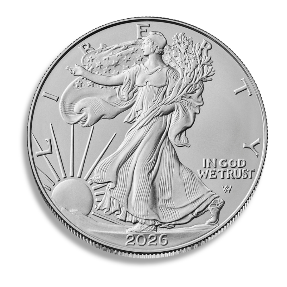 Silver coin
2026 Silver American Eagle – BU
Compare its current premium with other one-ounce silver formats.
View Current Price & Availability →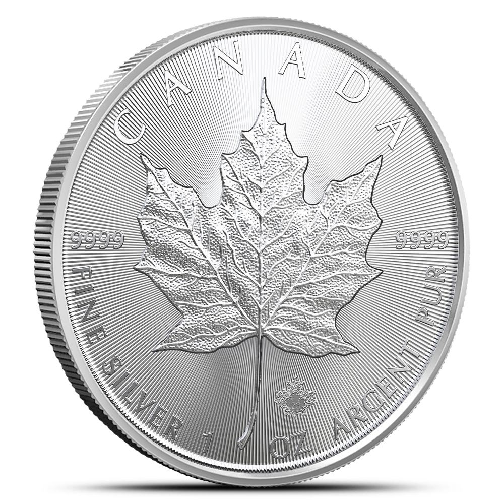 Silver coin
2026 1 oz Canadian Silver Maple Leaf
Review the dated coin’s product details and condition.
View Current Price & Availability →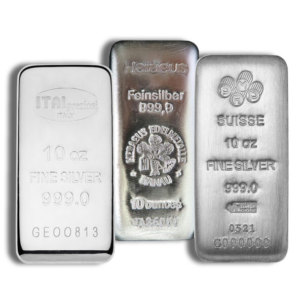 Silver bar
10 oz Silver Bar – Brand Varies
The delivered brand may vary. Review the current listing.
View Current Price & Availability →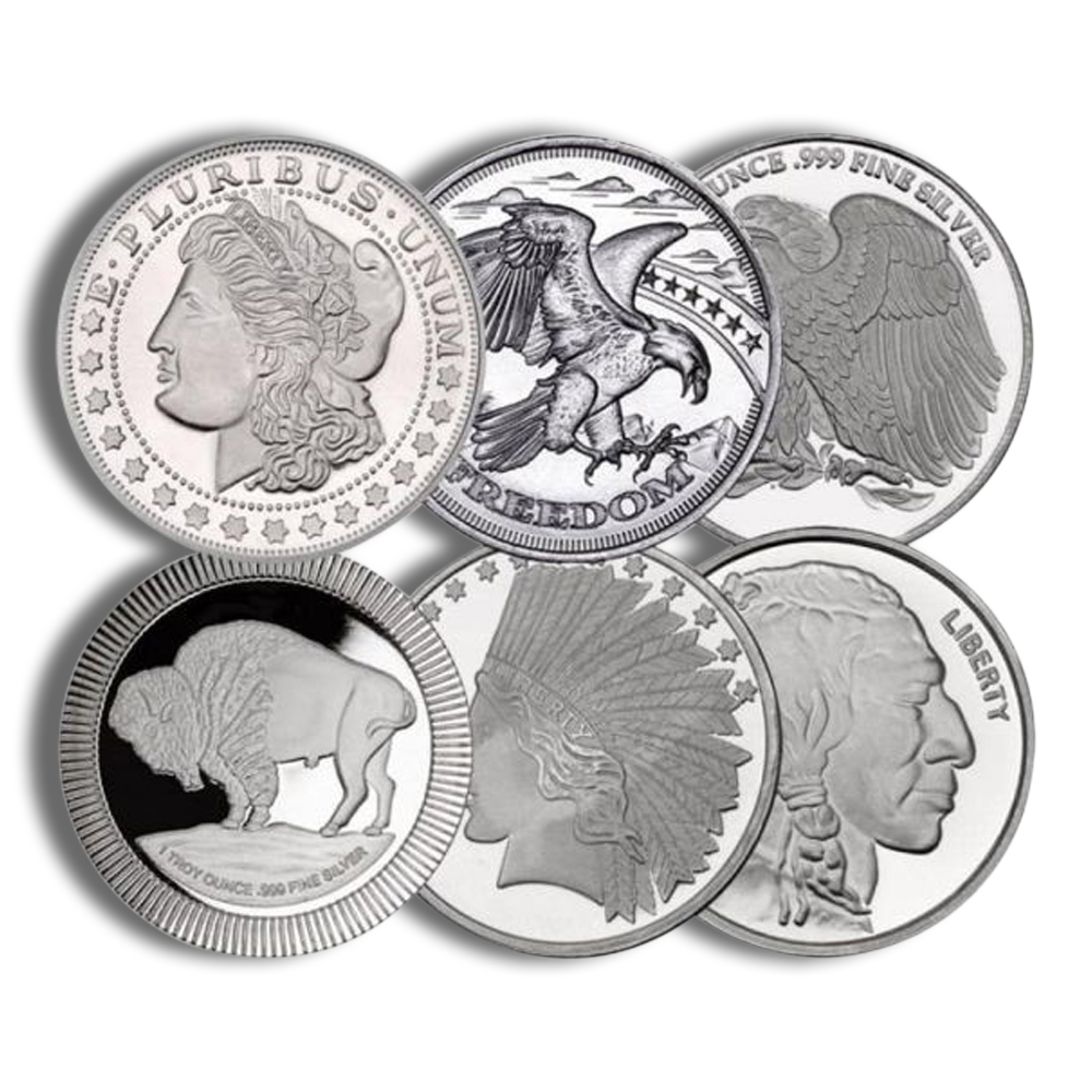 Silver round
1 oz Silver Round – Design Varies
The design may vary with inventory.
View Current Price & Availability →Frequently Asked Questions
Are the charts on this page live?
No live price feed is embedded in this article. Follow the linked data source and check its observation time before using a price.
Why are spot and futures charts different?
A futures price relates to a specified contract and delivery period. A spot reference concerns near-term settlement. Confirm which one the chart displays.
Can I compare all four metals on one chart?
Yes, if the chart offers that feature. Use the same currency and dates. An indexed percentage view is useful for comparing movements when the metals have different price levels.
Does a price chart show what Agate will charge for a coin or bar?
No. A physical product’s checkout price can include a product premium and other order costs. Use the current listing and checkout total for a purchase comparison.
Can a chart tell me what my coin is worth?
It can help estimate metal content value. Authentication, condition, rarity, product demand, and an actual dealer bid require separate evaluation.
Related Agate Guides
Sources and Review Information
Research review: . Source methods and product terms can change. This article contains no live quote or guaranteed product availability.